The following book covers were inspired by the work and methodology of April Greiman, an important figure in graphic design. Among many others, rule-breaking, layered and playful are a few words to describe her unique approach. I used these adjectives to guide my process in making my own Greiman book covers; one with type, one with type and two images of April, and one with type and two images of metaphors that describe April or her work. My process and other drafts can be found here.

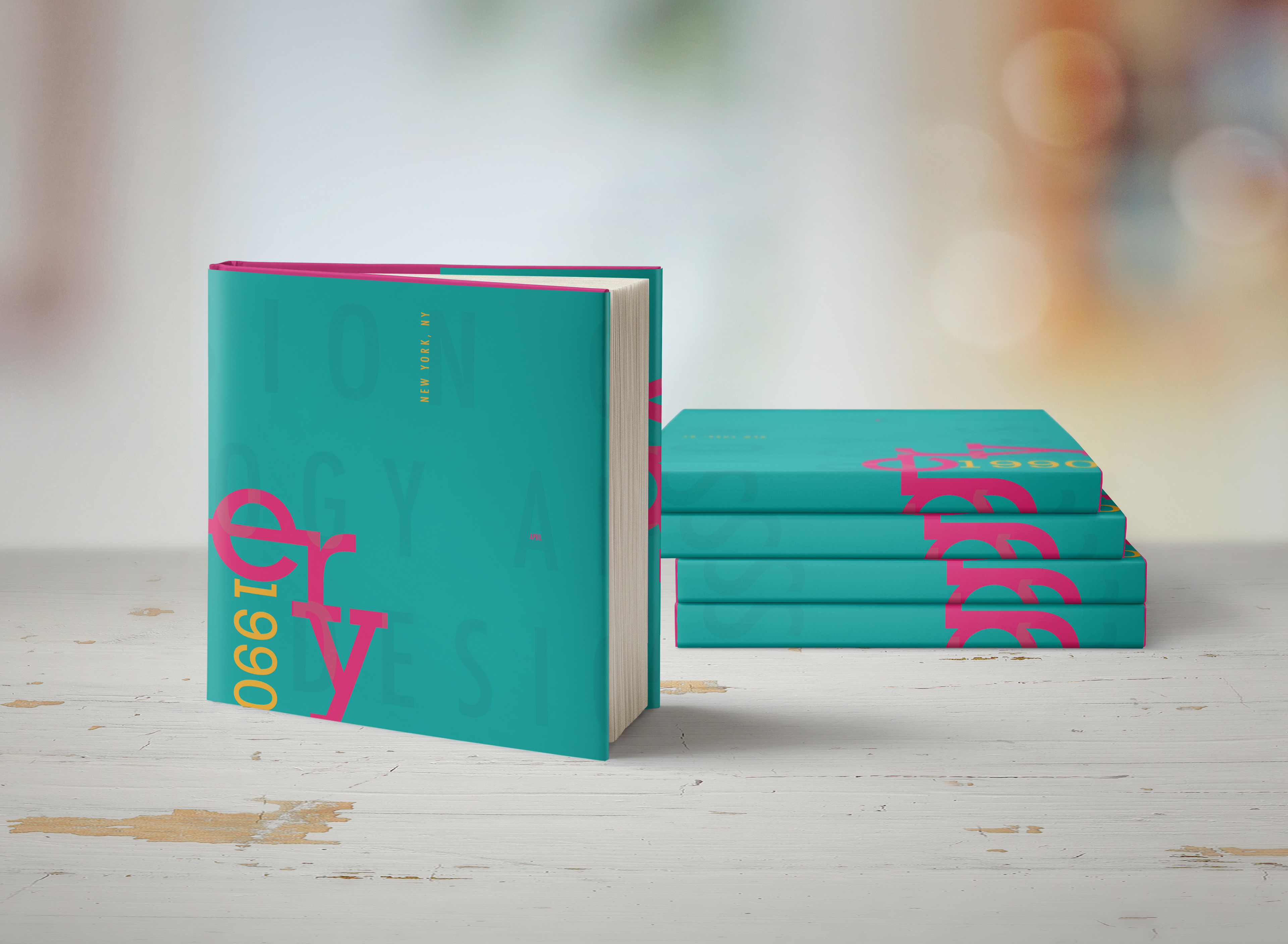
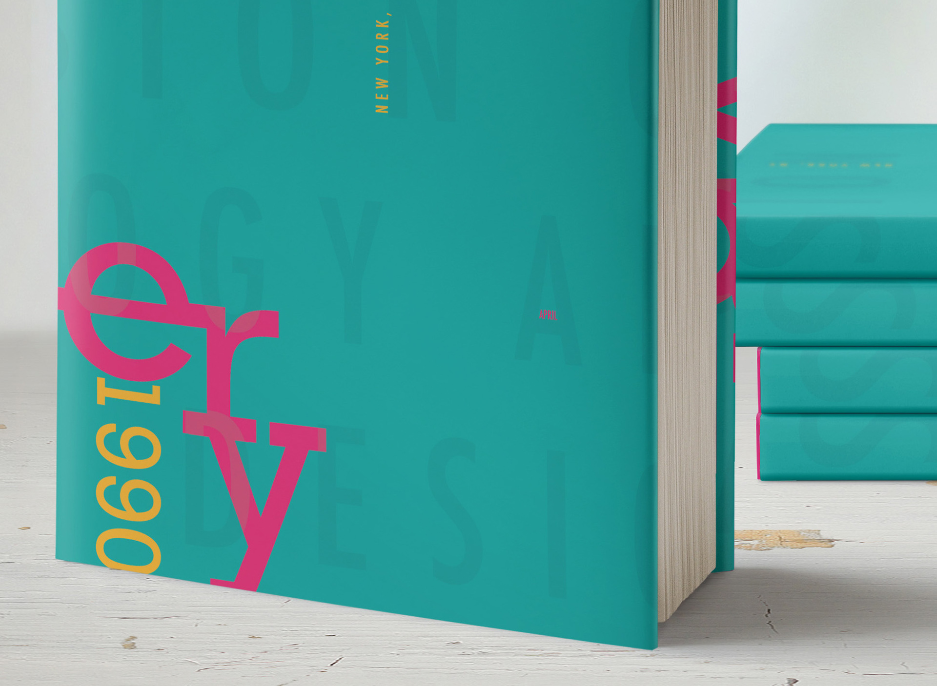
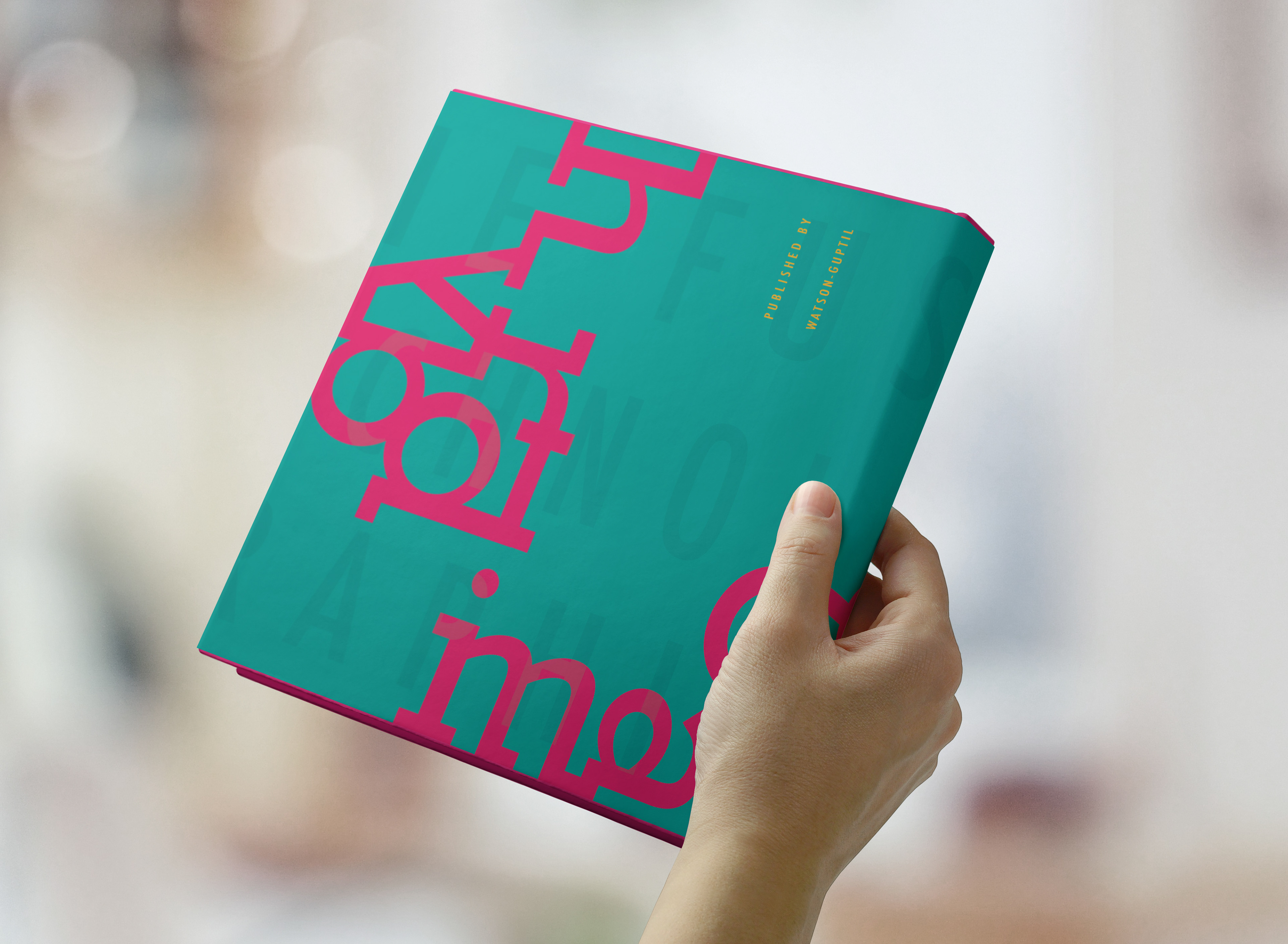
Type + April: My goal for this design was "unorthodox". I started this design by arranging the type in an interesting way and pushing the boundaries of legibility. I then used a clipping mask to crop a teal, monotoned image of April smiling inside of "1990". I placed my second image of April after making it a pink monotone, and duplicated and multiplied the images to add layers and movement to the design. Finally, I placed an opaque yellow-orange layer on top to add warmth and elevate the entire design.
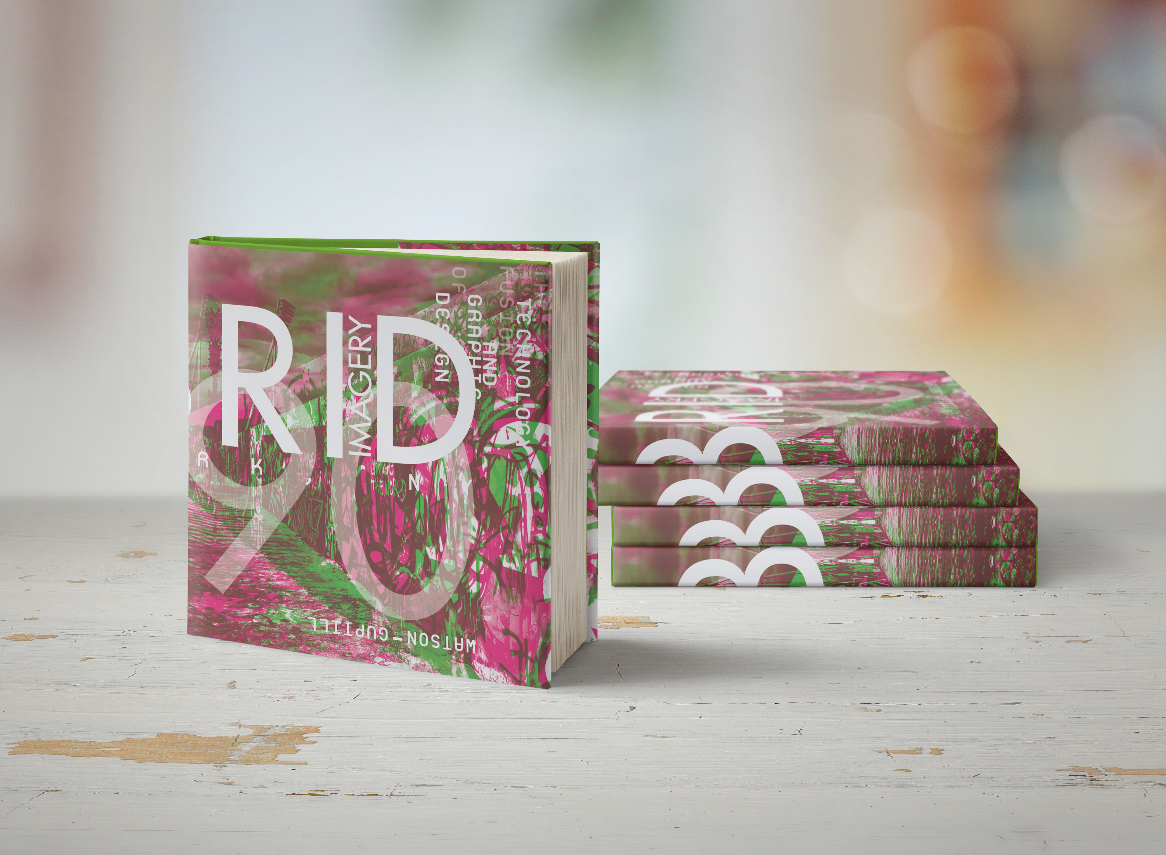
Type + Metaphor: My goal for this design was "energetic" and "non-conformist". Starting with images this time, I chose a photo of a wall of graffiti to highlight April's rebellious and controversial approach in design. I created complimentary monotones of the image and layered them to add complexity and energy. For my type, I explored stacking and combining the content in a professional and visually pleasing way to contrast with the background imagery.
Type: With the main goal of "playful", I used elements such as color, placement, and opacity to create contrast and challenge legibility. While taking up the full space of the cover, I kept my design clean and easy to read. While serving as an introduction and guide into the content, the cover itself is designed to be explored.
A close-up of "Type": I played with hierarchy by hiding April's name, which would usually be a focal point in a design. Her last name is hidden on the inside flap. I used size and color to make the type read as intended regardless of position or orientation.
Backside of "Type": With the word "playful" in mind, I viewed the Rockwell typeface as puzzle pieces and explored how the letters could fit together.
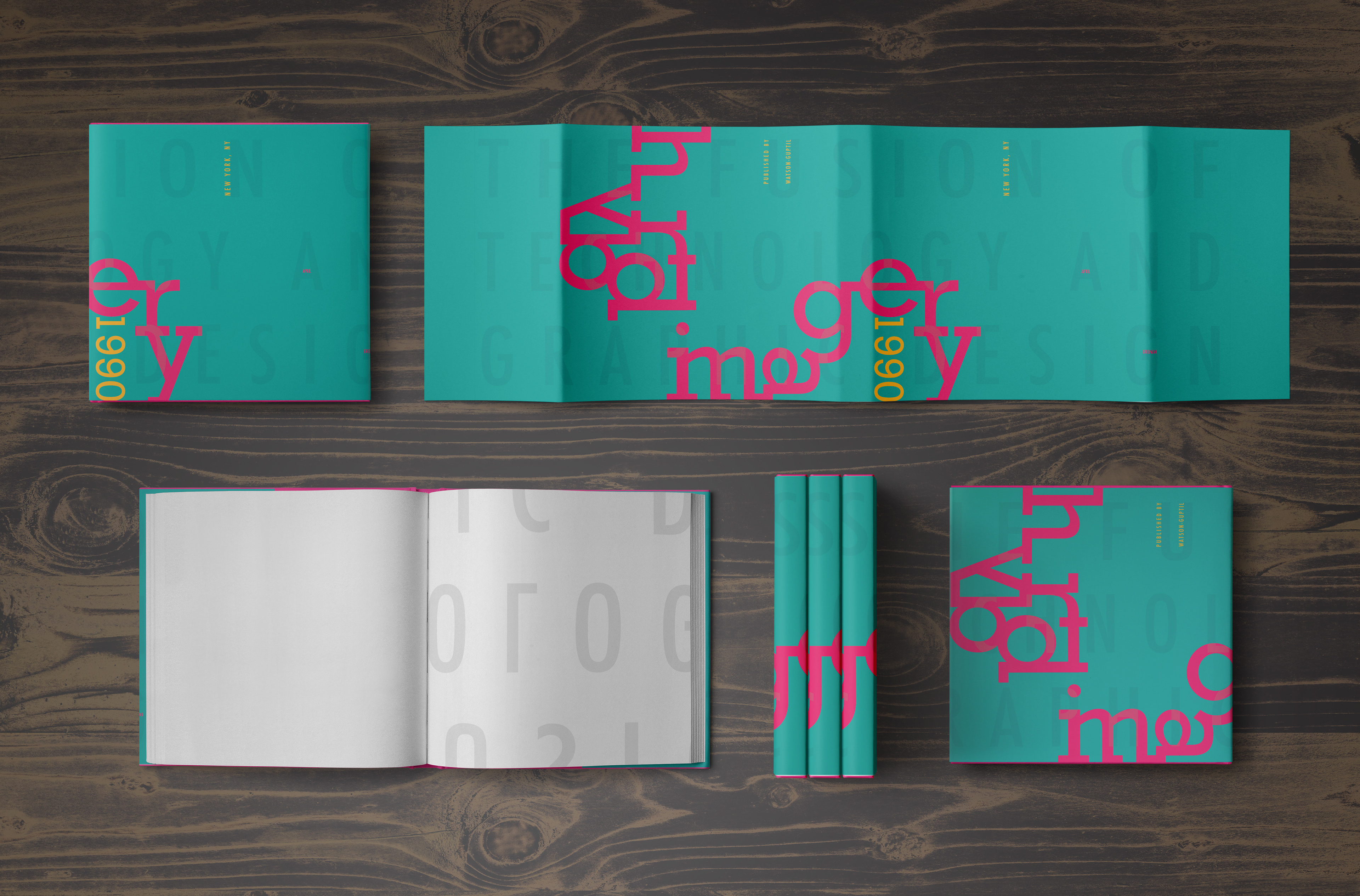
Full spread of "Type": The background type retains its importance while flowing off of the sides and remaining slightly opaque.