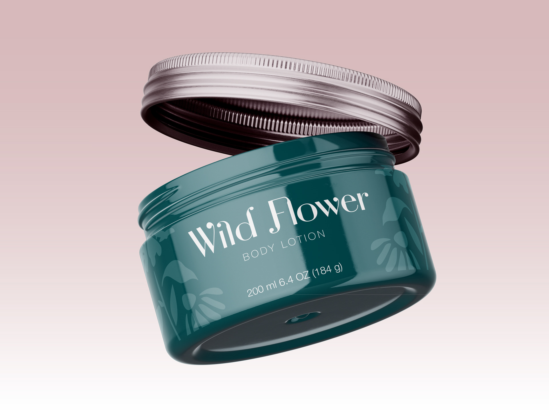
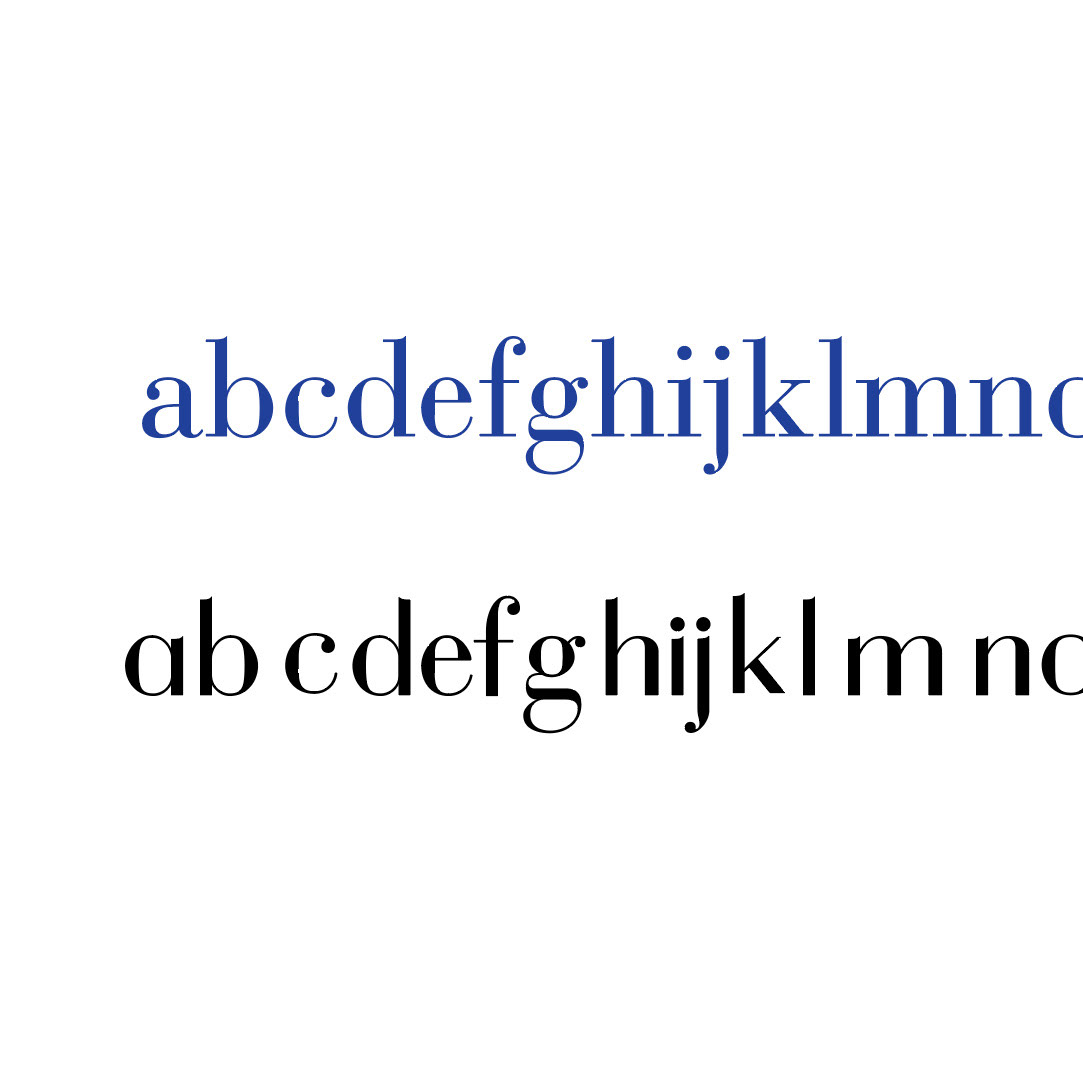
I used Bauer Bodoni as a starting point to create my own typeface, Bodoni Flow Sans. While working, I used the words soft, modern, and decorative to guide my design.
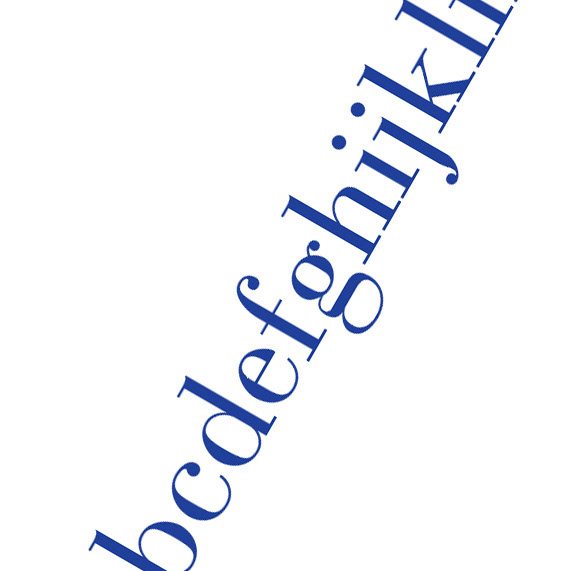
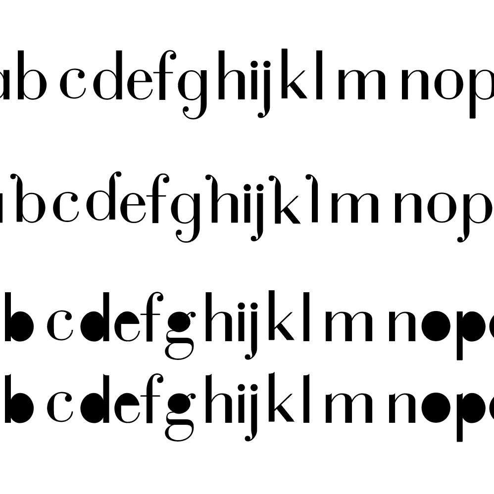
I softened Bauer Bodoni by removing its serifs.

To make Bauer Bodoni feel even more modern, I simplified and separated some letters.
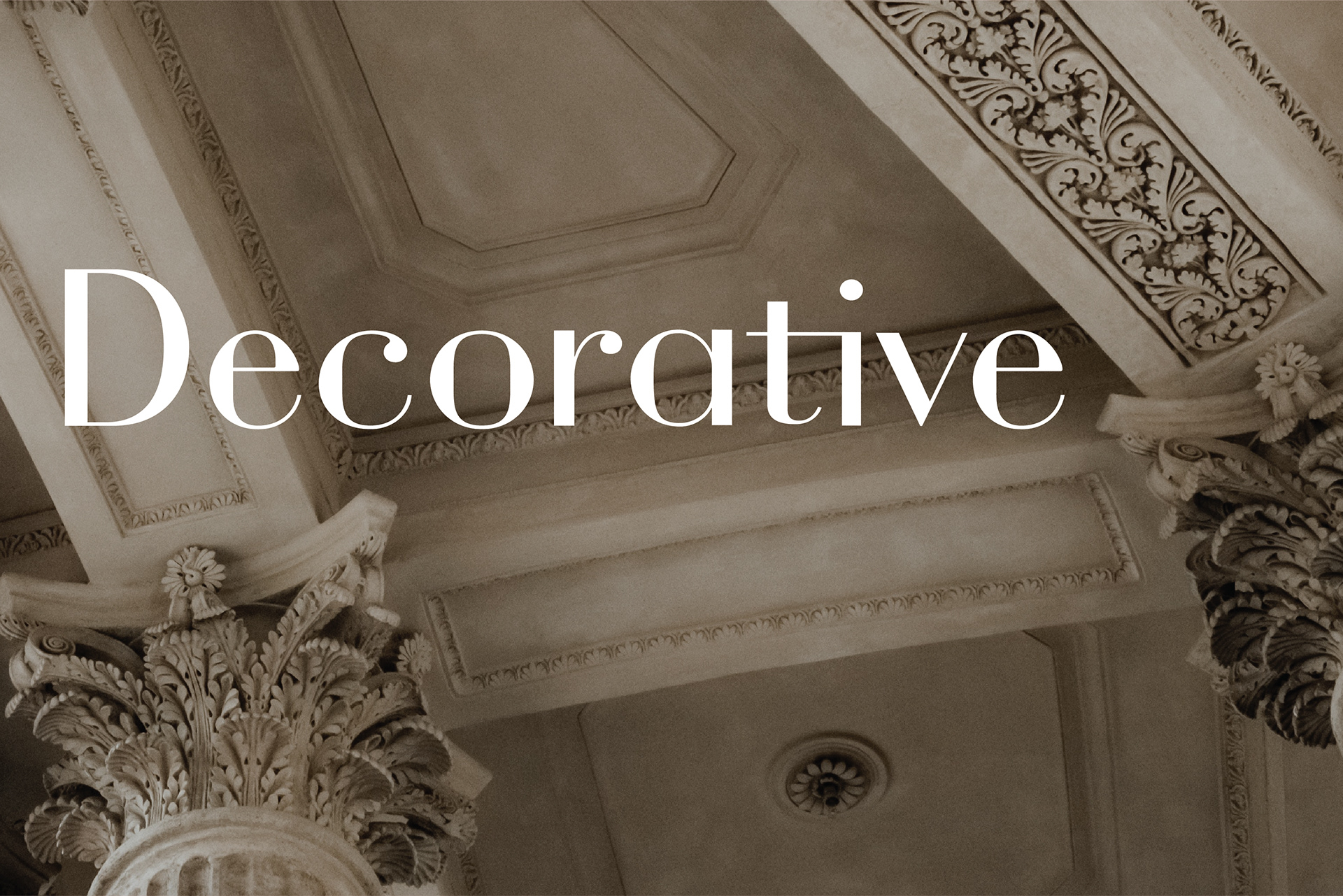
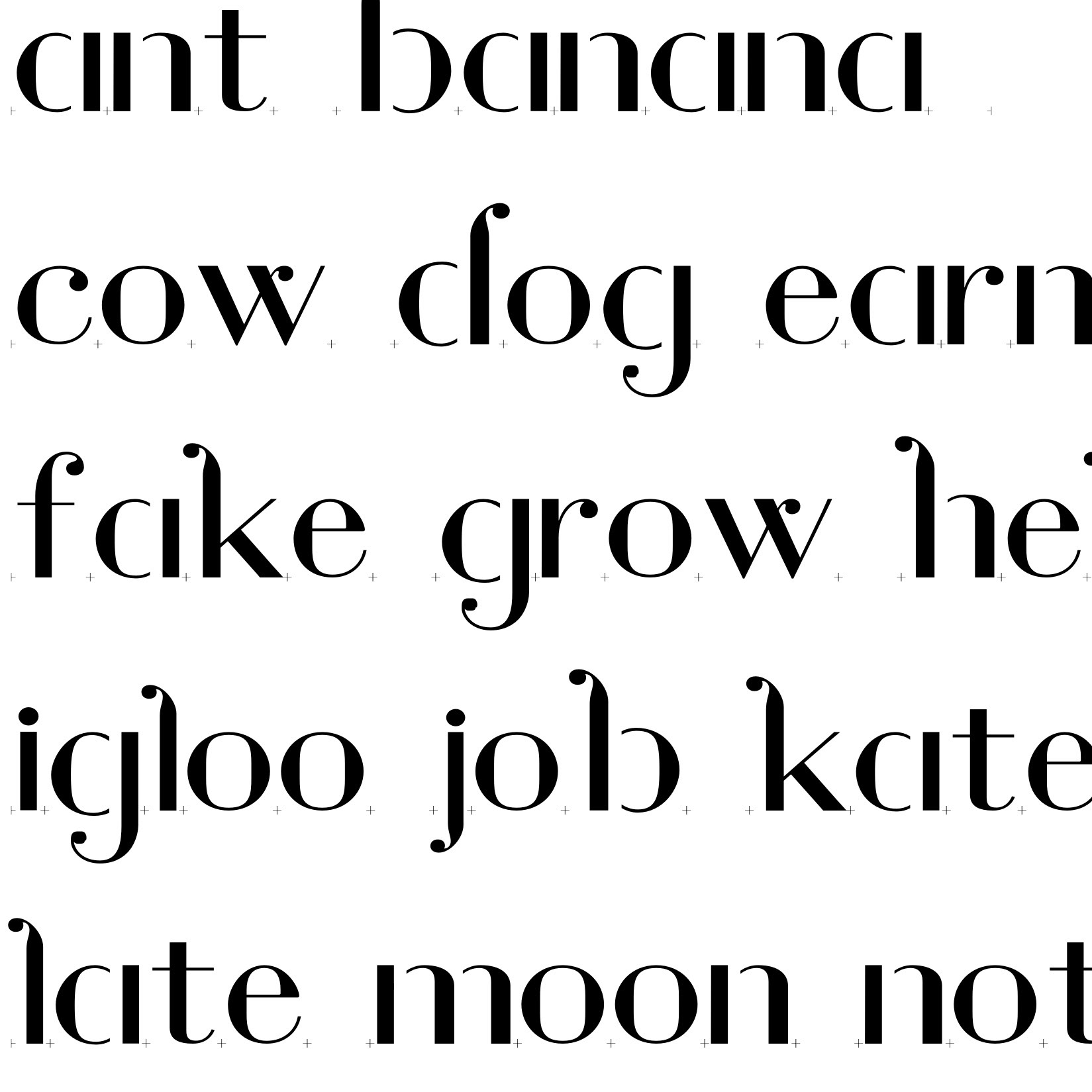
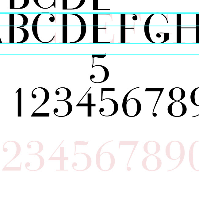
I kept Bauer Bodoni's ball terminals and added more details to make the typeface more suitable for titles and decorative use.
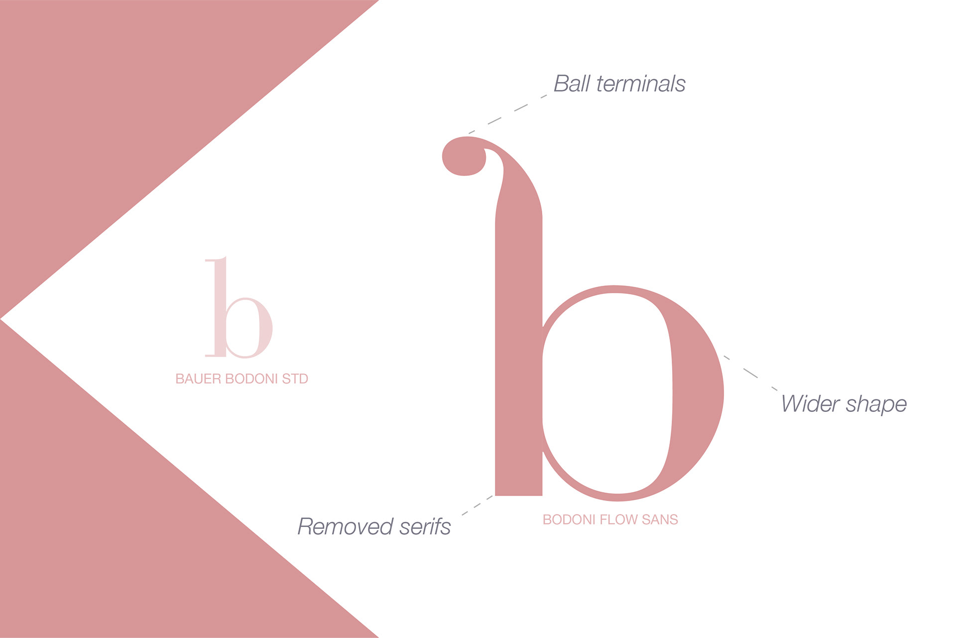
Bodoni Flow's lowercase B and Q.
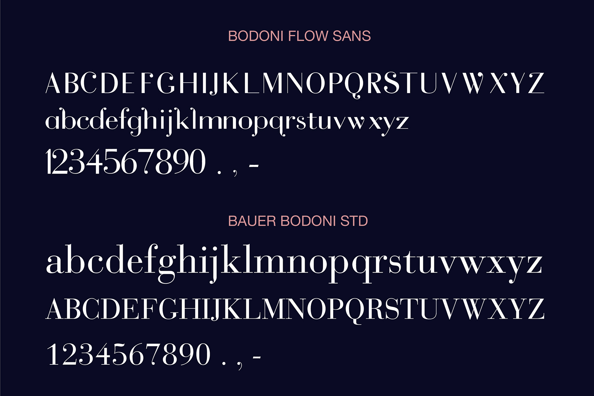
Bodoni Flow's uppercase W.

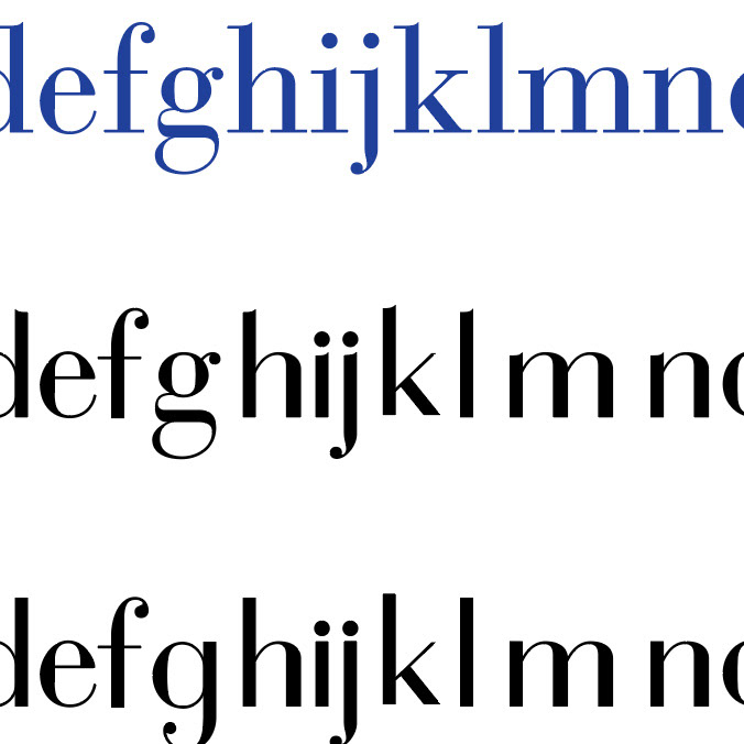
Although Bodoni Flow is more modern and playful than Bauer Bodoni, it still retains its classic and elegant feel.
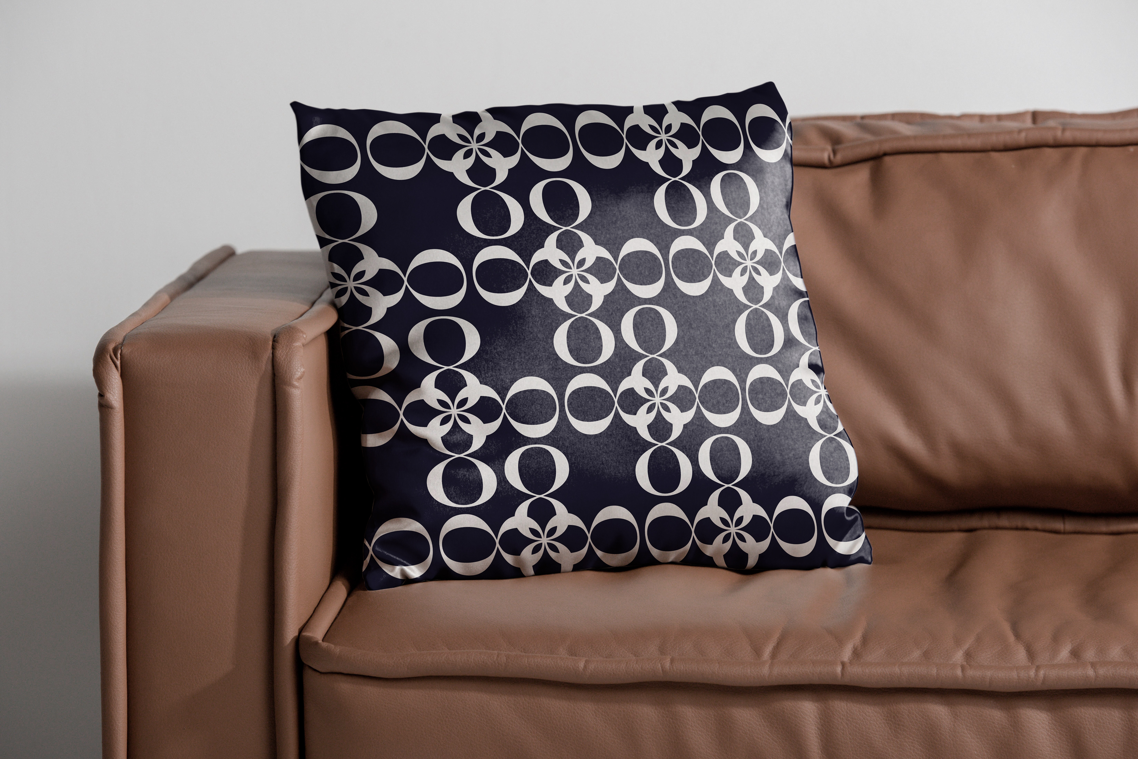
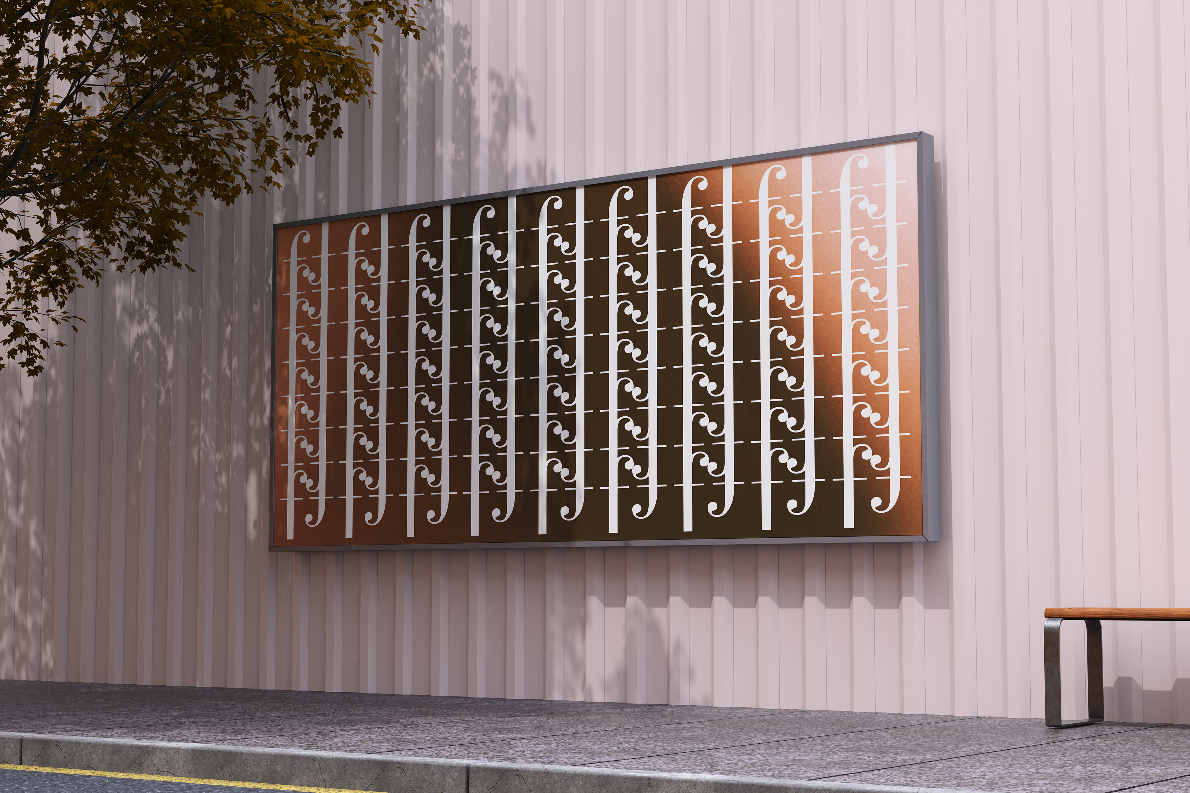
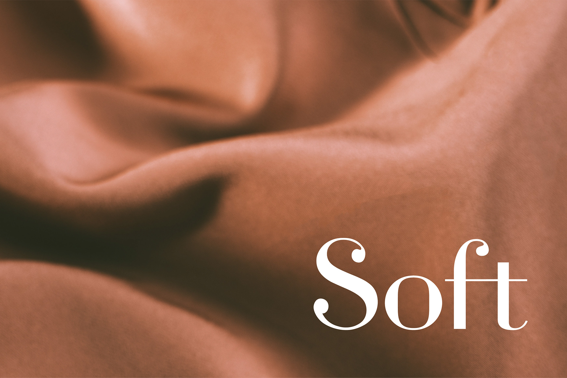
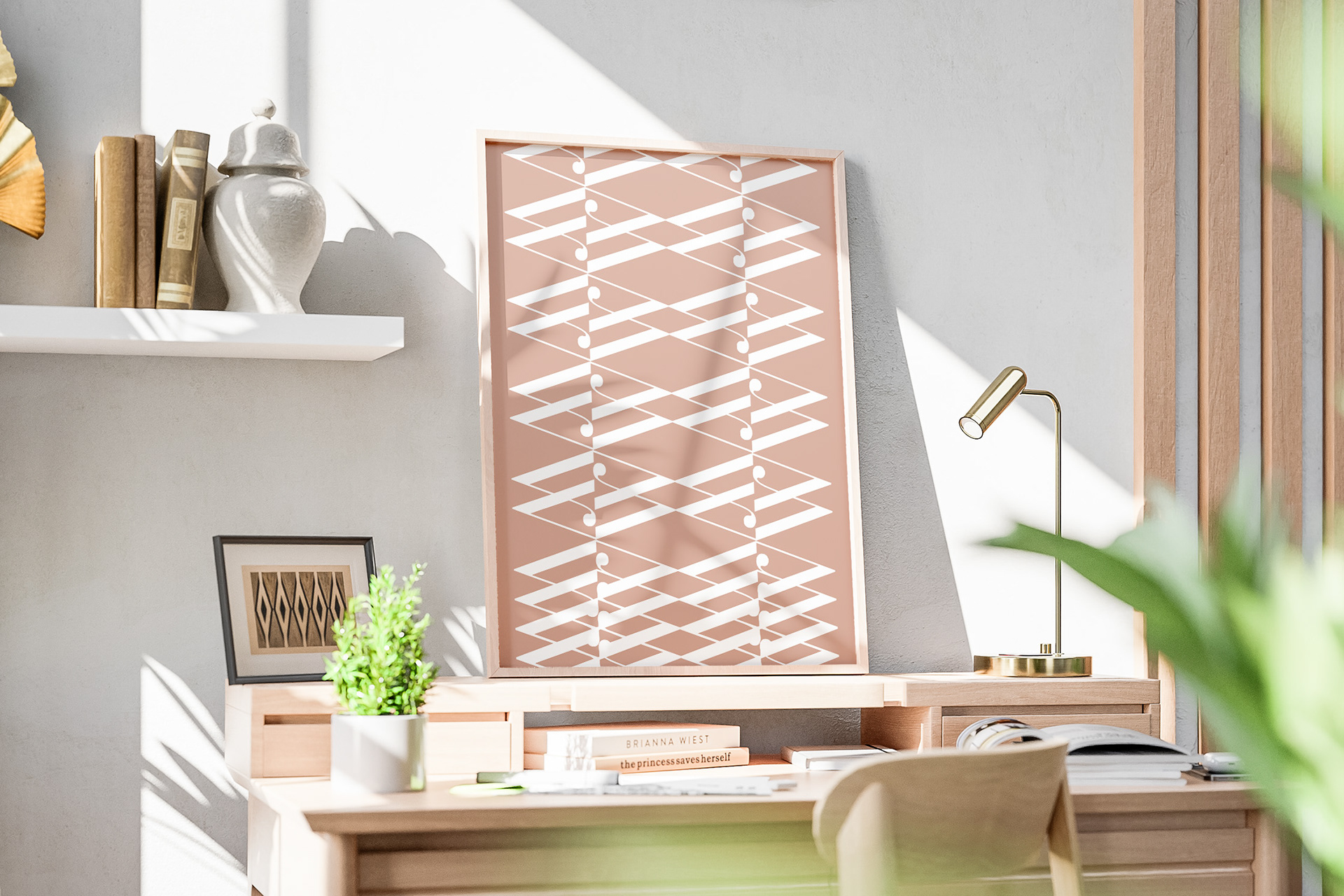
Bodoni Flow isn't just for type - use characters to create visually interesting pieces with lots of movement.